As part of the BC Culture Days Ambassador program, I got to work with an awesome mentor, Natasha Smith, with 25+ years of experience. She showed me a technique using dry wall compound. My original idea was to include natural elements that inspire me and to make the painting looks like a puzzle. In addition to plants and flowers, I think this concept of putting a puzzle together is also a recurring theme in my art, like this illustration:

I thought I would put the 5 elements that the ancient Chinese thought made up everything between heaven and earth: metal, wood, water, fire, and earth. Earth is repeated so I have the 5 elements plus the heaven carved into the 6 blocks on my painting.
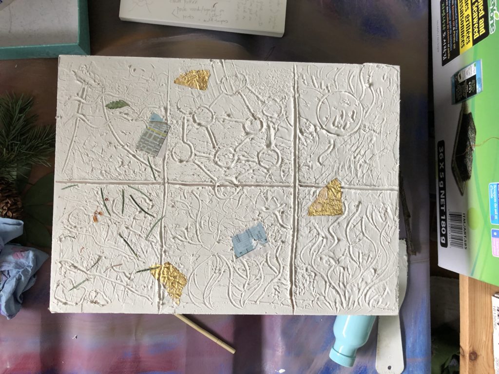

At the beginning, I used colours that represented each element. Sky and water are blue, fire is red, metal is gold, earth is brown. They looked pretty bad and I’ve learned from illustrations that we don’t need to use realistic colours. So I painted over them with more colours in geometric shapes. I added more collage elements from prints I made from real leaves (another technique my mentor showed me). I painted the carved lines of the elements black, added more colours in lighter shades and added thick black lines over them.
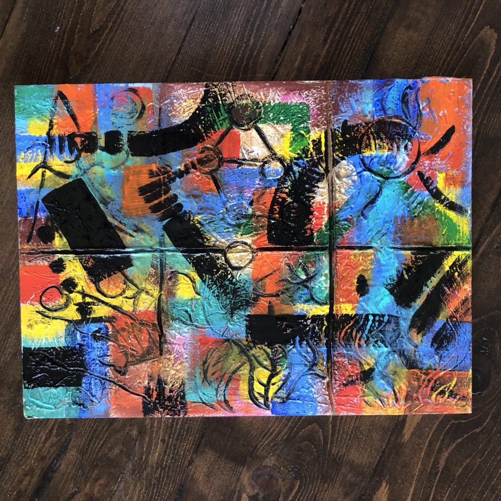
I kind of like this painting with lots of colours. At the time, my mentor Natasha was showing me colour harmony and the use of colour in paintings. I was planning to make another painting using the colour concepts I just learned for comparism. Then I saw a call for submission for a juried exhibition held by the Community Arts Council of Richmond. The deadline was coming up soon so I decided to paint over this painting with a new colour scheme.
I’ve taken a class on colour theory before and learned how to mix colours. But this time, I have an actual painting to work on. There’s a big difference between learning about the theory and applying it.
First, my mentor Natasha said add small amount of dark colours to lighter colours. I had been mixing colours the other way around. It sounded like minor stuff but it really made a difference! Blue has more value than red than yellow so just a tiny bit of blue will change the color of yellow quickly. If I add yellow to a big blob of blue, I will never get the colour I want unless I use the whole tube of yellow (maybe more).
I started making colour charts, mixing tints and shades of a colour by adding white or black. Then I started mixing two different colours, add white or black. I can also add white to a colour first and then add black. I get all kinds of different colours mixing them in different orders.
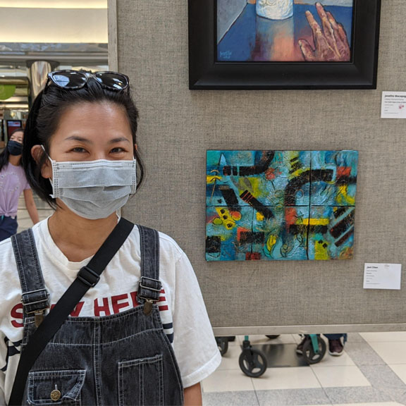
Here are what I’ve learned from making this painting that was selected for the Mid-summers Arts Dream exhibition.
#1. Don’t use colours straight from the tubes!!! Mix my own colours to make the paintings more interesting. This reduces the saturation which I found the case when I first started adding more colours to this painting. Yellow may be an exception, I used this colour straight out of tube in some places.
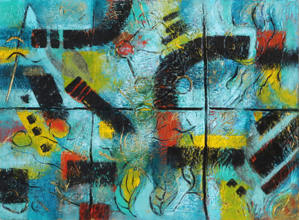
#2. Another reason to mix colours is to create harmony. I mixed blue and green to different degree, blue and yellow, then yellow and red so all the colours are related.
#3. Warm and cool colour constrast. I decided to make the backgrounds mostly cool because of the sky and water and to bring back the orange and yellow for contrast. I mixed the yellow in some areas with a tiny bit of blue and the yellow is related to the orange I mixed. I had a lot or orange at the beginning. I tried to erase some of them and see if they still worked and I felt by removing some oranges didn’t lessen the painting.
4. Value contrast. In addition to warm and cool colour contrast, there’s dark and light contrast. Sometime you can see dark and light by squinting your eyes when you look at the painting but I just take a picture and make them black and white on my phone to check. I didn’t have much dark and light contrast so I lightened the blue around my bold black stripes.
When I use my iPad, I can just pick and choose the colours I want to use very easily. With paint, you have to physically mix the colours and sometime I couldn’t get the exact same colours. There is so much to learn and I am planning to make another one with warmer colour scheme (maybe because it’s almost November now). I have new found respect for painters that use colours beautifully!

Here’s the before and after again. Which one do you like more? In the before painting, my eyes just go all over the place. In the after painting, my eyes go to the black first, then the yellow and orange and kind of follow the black stripes around the painting clockwise. How about you?
After I found out the painting was accepted into my first exhibition, I painted the sides black, added a hook (my husband Jordan did) and signed the back. I also have to write an artist statement:
In Elements, I investigate the diverse yet interdependent nature of the universe: heaven and the five elements of metal, wood, water, fire and earth. The concept of the five elements is widely used in Chinese traditional medicine, philosophy and feng shui. It is said that everything between heaven and earth are made of these five elements. They have vastly different properties yet are interdependent of each other. I am interested in the natural cycle to everything between Heaven and Earth, how wood gives rise to fire, fire gives rise to earth, earth gives rise to metal, metal gives rise to water and water gives rise to wood, completing the cycle. Chaos arises if we go against the natural flow of the universe and we thrive if we live in harmony with the laws of nature.
The built layers of the painting are embedded with different materials such as aluminum foil, pine needles and prints of leaves. The elements are separated by their respective boxes yet the intaglio, collage elements and paint connect them together in different ways to create unity.